Padose.com (Buyer): Enabling Digital Access to Fresh Produce from Local Pushcart Sellers.
The buyer platform of Padose.com enables customers to buy from local sellers and support them.
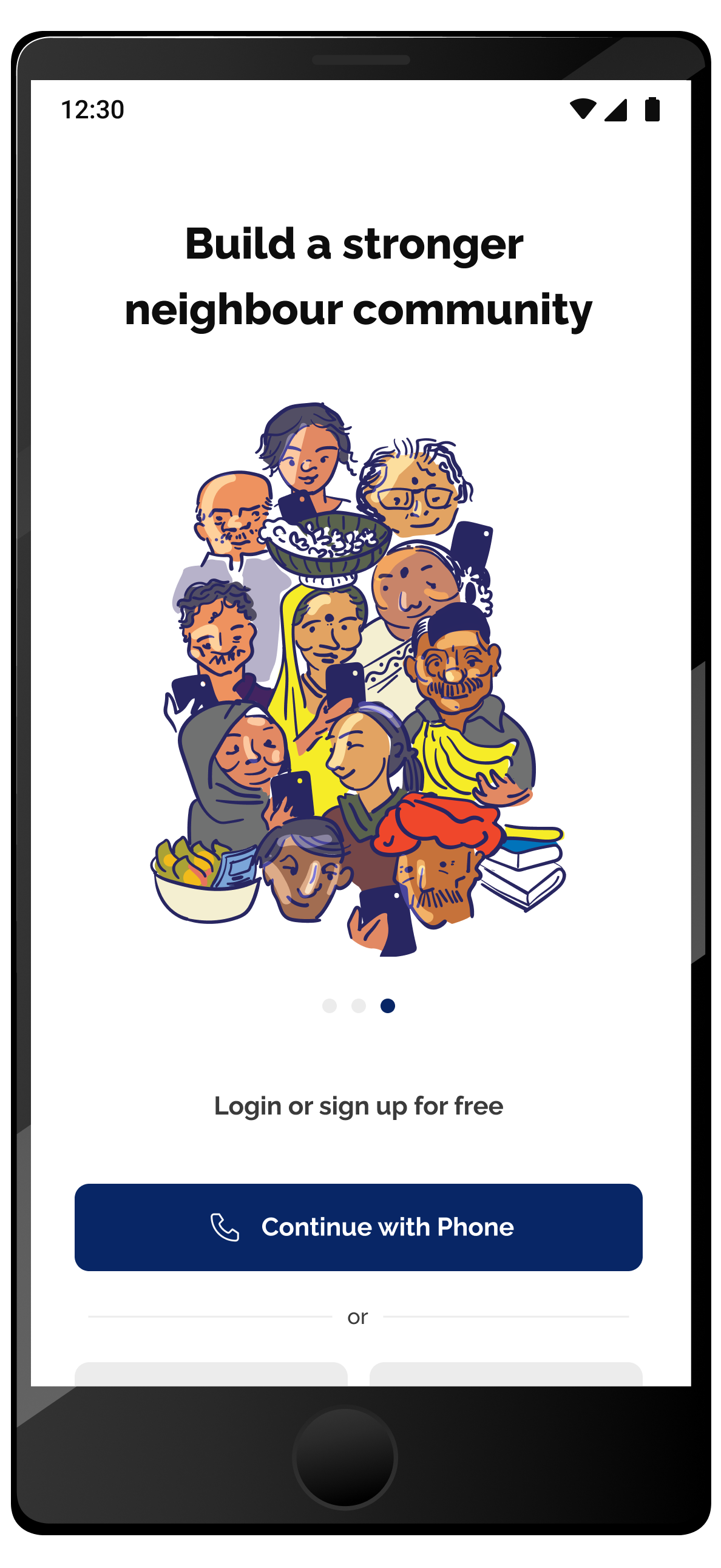
Padose: The Customer ExperiencePadose (Buyer) represents the customer-facing platform of Padose (Seller), detailing the process through which customers browse, purchase, and interact with products sold by pushcart vendors from the Padose (Seller) app.
My role
Product design
User research
Collaborators
Product Designer
Founder and CEO
Frontend engineer
Illustrator
Client
People Tech Ventures
Timeline
Feb 2023- May 2023
Project Overview
Balancing Tradition and Convenience: The Shift in Fresh Produce Shopping in Urban India
Urban Indians have long relied on daily fresh produce from local vendors. Now, fast-paced routines are pushing more people toward convenient online and supermarket options, often trading freshness for speed. This shift emphasizes the need to digitally connect households with trusted neighborhood sellers.
How might digitization of this experience benefit consumers?
No middleman
Digitization connects consumers directly to local vendors, ensuring fresher, more authentic produce at fair prices without extra markups.
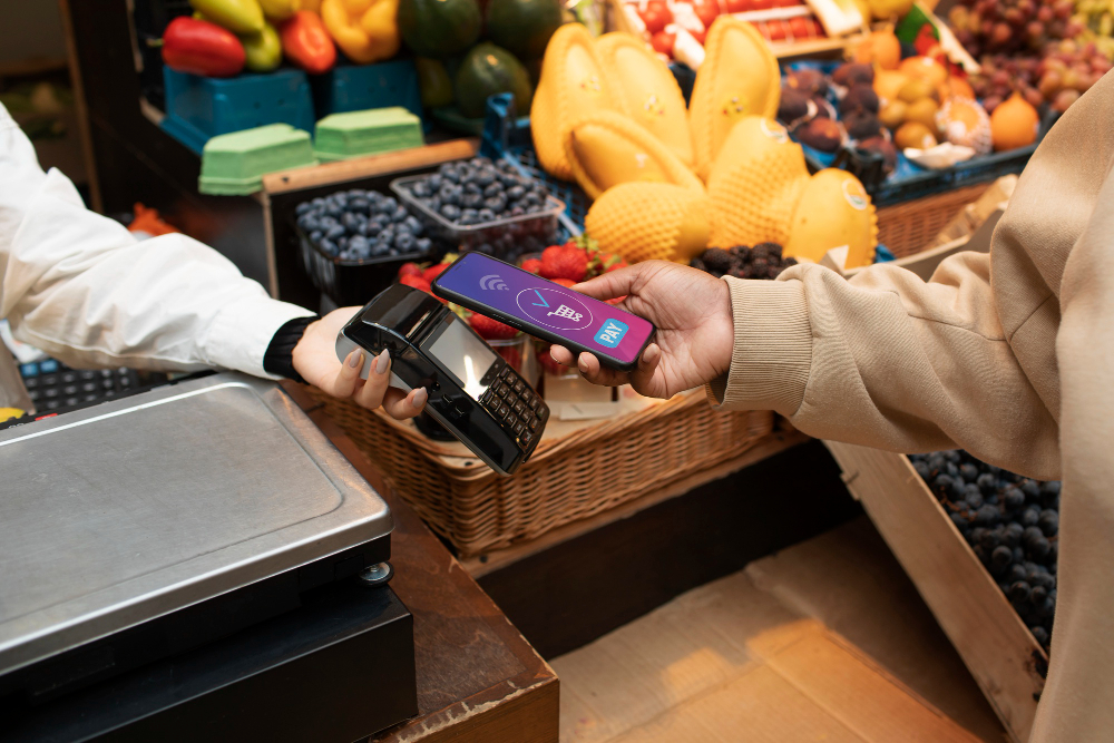
Digital Payment Integration
Padose Buyer integrates seamless digital payment options, making transactions faster and more convenient for both vendors and buyers, expanding their sales potential.
Trust and familiarity
By connecting vendors directly with customers through a trusted digital platform, the platform builds trust, improves communication, and helps reduce food waste by sharing real-time inventory.
Survey
Why consumers want to buy from street vendors
I conducted a survey with 40 people to understand their fresh produce purchasing patterns of buyers and their feelings and ideas towards fresh produce sold in carts and on the streets.
Age distribution of respondents
Frequency of fruit and vegetable purchases
Sources of fresh produce purchases
Reasons for preferring local vendors
Key observations from the Survey
Purchase Options
Younger individuals (18-39) are more open to modern shopping options, often combining multiple sources like supermarkets and online platforms for convenience.
Purchase Frequency
Most respondents buy fruits and vegetables a few times in a week, indicating a preference for frequent, smaller purchases rather than bulk buying.
Key Motivators
Freshness and supporting local livelihoods are the dominant motivators for choosing local sellers over supermarkets or online platforms.
How might we bring the convenience of digital shopping to fresh produce from neighborhood vendors?
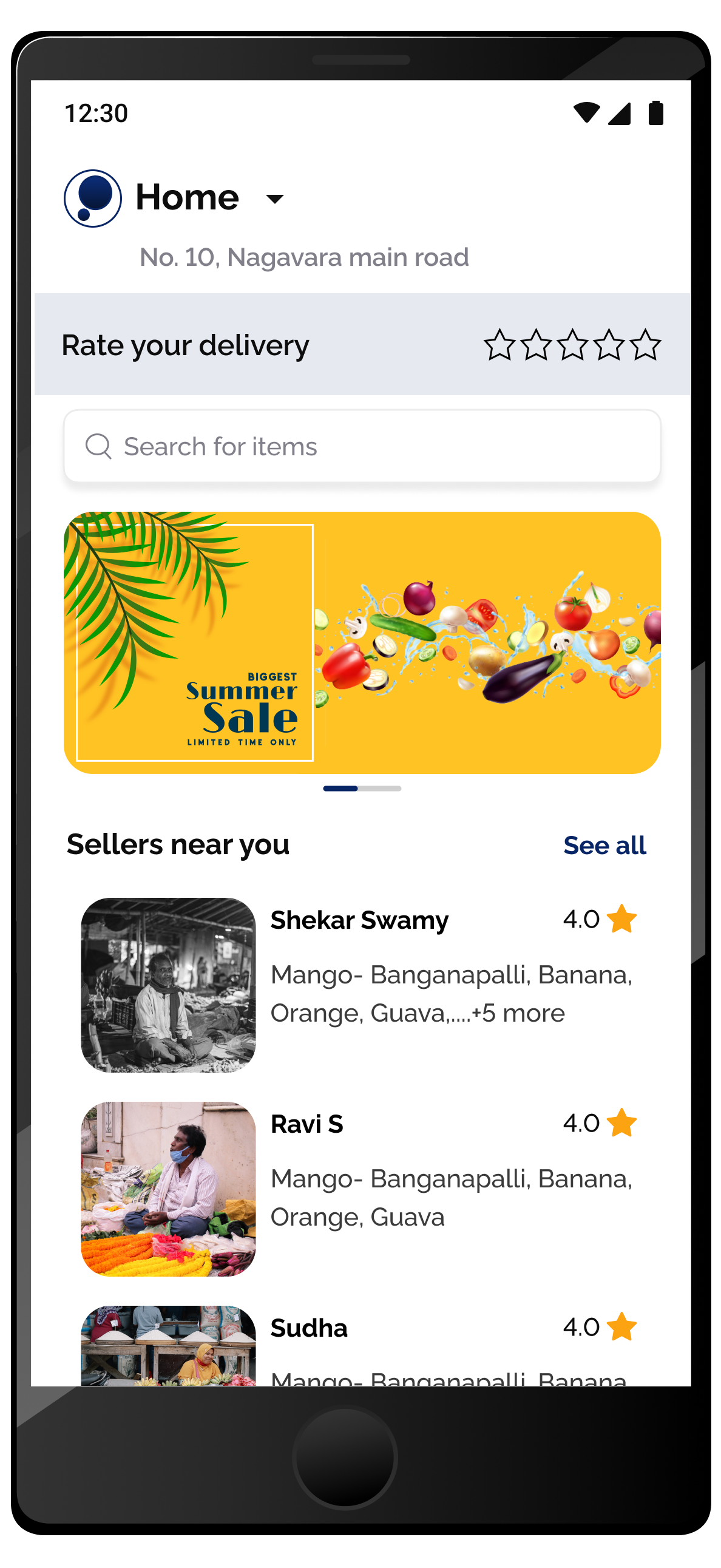
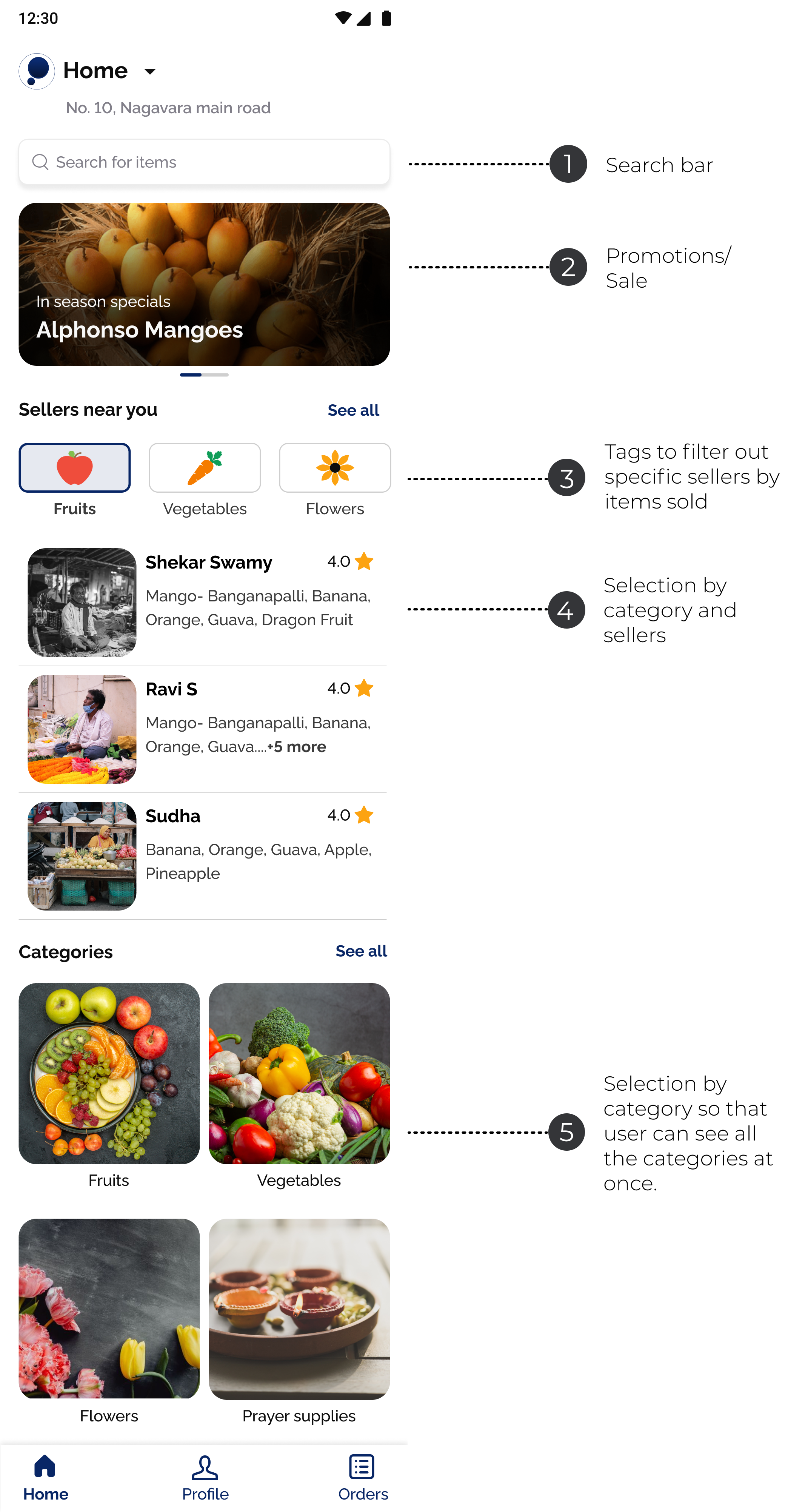
Homepage
The homepage highlights local sellers, enabling customers to browse by vendor if they have an existing connection, or to search directly for specific products.
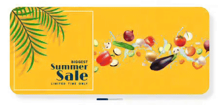
The vibrant banner visually signals freshness and quality, using bold colors and appetizing imagery to quickly capture attention and build user trust in the produce offered.
Although this section highlights local sellers, its primary aim is to promote their products and encourage purchases by showcasing what they offer.
Product Listing
With up-to-date product listings, vendors can highlight their daily selections, allowing buyers to quickly find what they need and discover what's in season. This makes it much easier for everyone to see current offerings and plan their purchases with confidence.
Design
Digitizing the physical experience
Purchasing from neighborhood carts connects people within their community. The final design is centered on bringing that spirit of connection online.
Adding items to cart
In Indian markets, it's customary for shoppers to receive coriander, ginger, and curry leaves as complimentary or low-cost add-ons with fresh produce. The add-to-cart process features an option to easily include these staples, preserving this familiar tradition in the digital shopping experience.
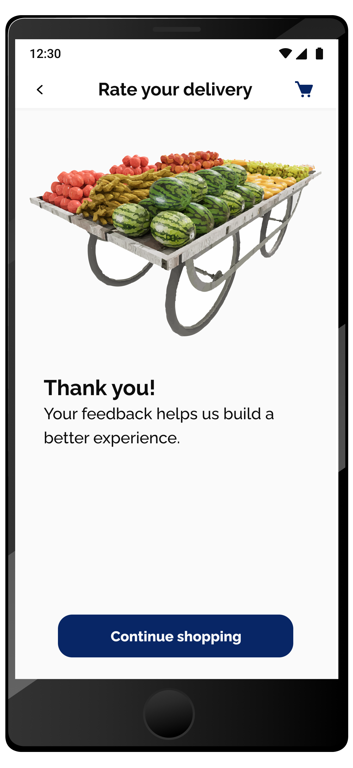
Order confirmation status
The order status screens use clear maps, bold status updates, and friendly illustrations to guide users through each stage of their order. Each step is visually distinct and easy to follow, helping users track their delivery.
Order just placed: Step-by-step order updates with clear visuals and address details streamline communication.
Order in Progress: Live delivery tracking with a neighborhood map offers real-time transparency and local context for the order journey.
Order delivered: "Order Delivered!" status and an instant star rating system encourage feedback and closure after a successful delivery.
What I learned from working on the customer side of Padose
Human Connection in Digital Design
This case study taught me the importance of highlighting the people behind the product. Even in a digital context, this case study taught me the importance of making the real neighborhood vendor visible to customers
Value of Clarity and Minimalism
Designing the interface was an opportunity to embrace neutral colors and minimal layouts. Clear, uncluttered screens help users focus on what really matters: the products, the vendors, and the buying experience.
Adapting Tradition to Technology
The project showed that technology should adapt and support traditional market practices, acting as a bridge rather than replacing familiar community rituals.