Bridging the Digital Gap with an Accessible Marketplace for Indian Pushcart Sellers on Padose
Designing for varied technological abilities of street vendors in India through accessibility and usability considerations.
My role
Product design
User research
Collaborators
Founder and CEO
Frontend engineer
Illustrator
Timeline
Dec 2021 - Dec 2022
The problem
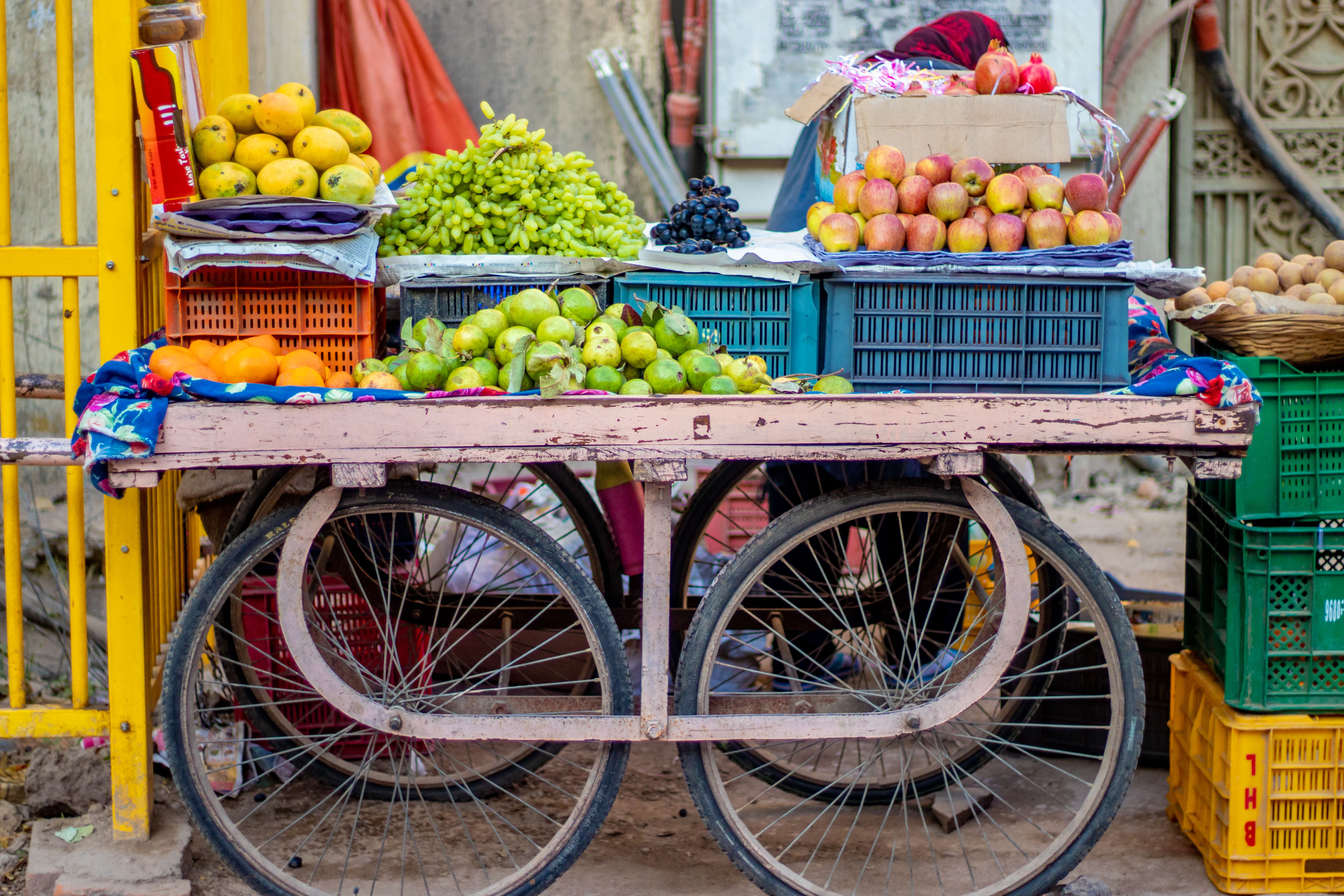
Business Practices of India’s Street Vendors
In India, pushcart vending represents about 14% of urban informal employment, with fruit and vegetable vendors making up a significant portion. While technology adoption is rising nationwide, many vendors continue to rely on traditional methods-such as manual inventory tracking, verbal sales, and informal record-keeping-to manage and grow their businesses.
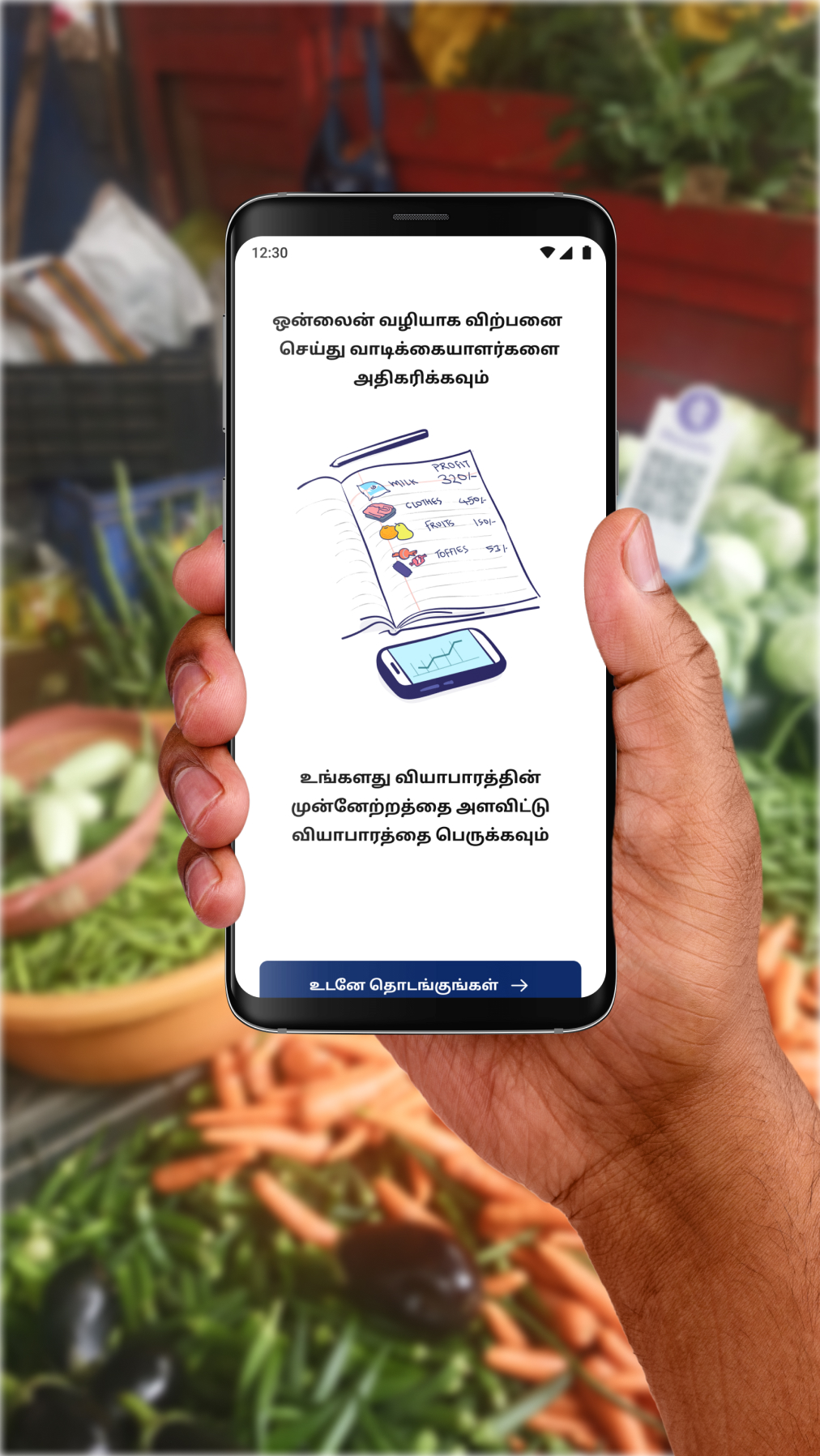
Overview of solution
Making digital inventory management easy and local for pushcart vendors
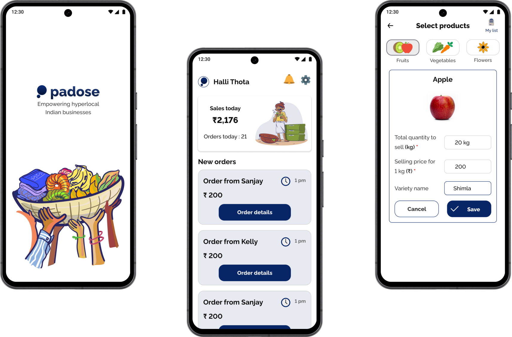
Padose is an aggregator that connects users with local street vendors of fresh produce in Indian neighborhoods. It focuses on simplifying inventory management for vendors, especially those with limited literacy or digital experience, helping them efficiently track and sell their products.
Jump to detailed solution
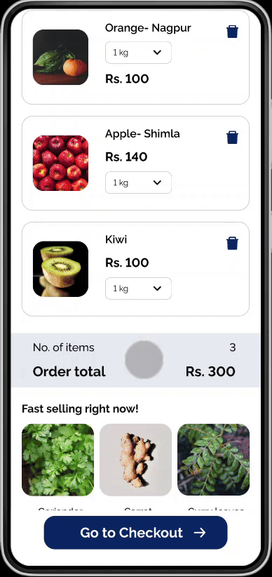
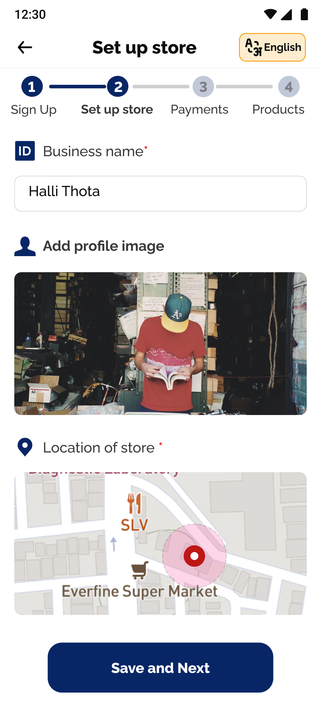
Product upload template
Simplifying the process of allowing sellers to upload their products posed a significant challenge. However, now with a preloaded inventory of different types of fresh produce, sellers now only need to input price and quantity.


Continuous Inventory Management
Through multiple iterations, we streamlined vendor input to prioritize essential details like quantity and price and add different varieties of items, minimizing cognitive overload while meeting customer needs for purchasing fresh produce.
Current challenges facing pushcart vendors
Profit uncertainty
Research reveals profit uncertainty due to price fluctuations, with street vendors and retail competition as significant threats.
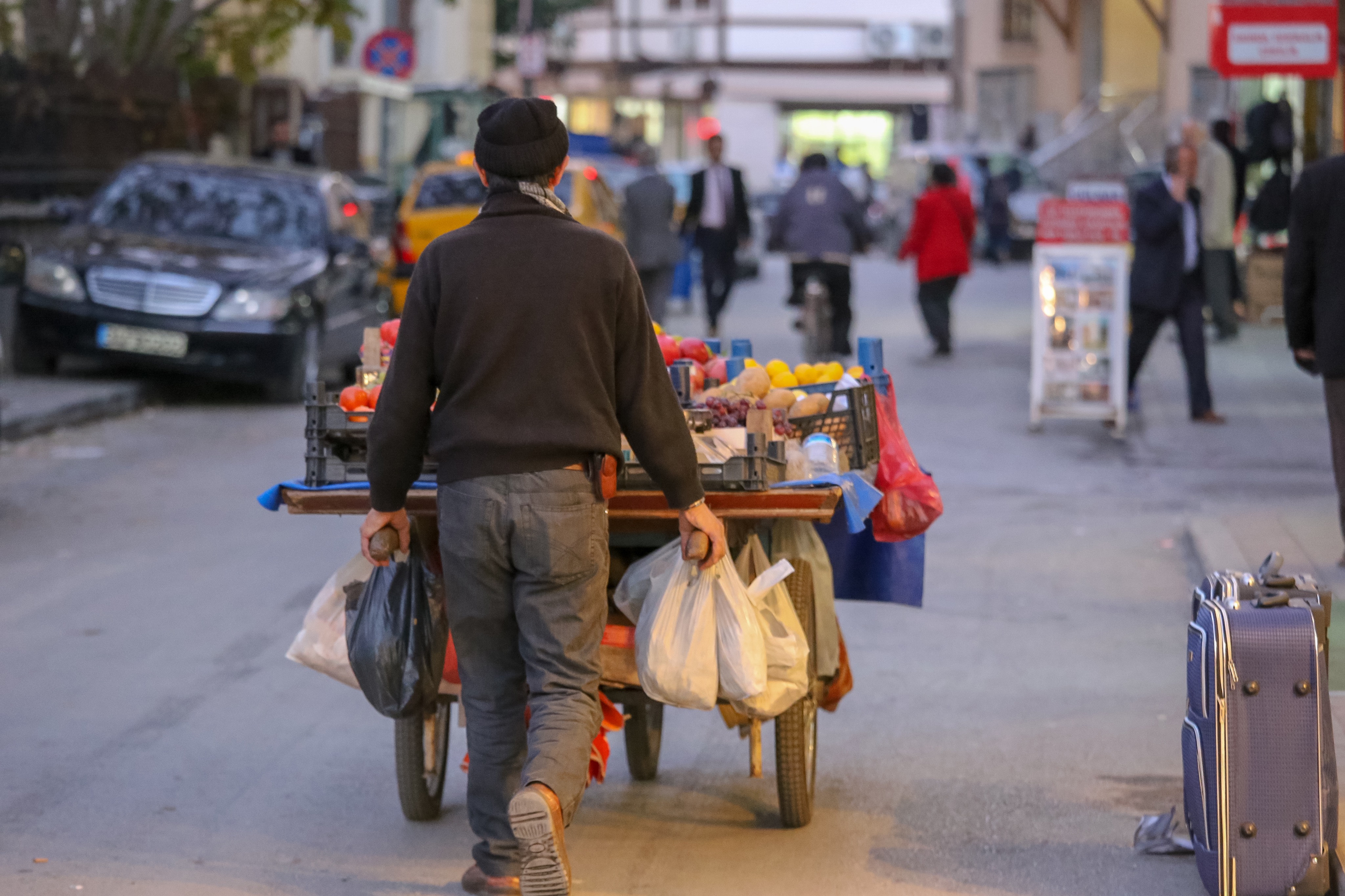
Restricted Sales
Vendors aim to maximize sales during peak times, but limited opportunities due to early morning and late evening work restrict their sales window.
Perishable Waste
They often sell perishable goods at low or no profit by day's end, leading to significant waste due to rapid deterioration.
Source: International Journal of Current Microbiology and Applied Sciences (IJCMAS)
Understanding the users
Identifying friction points and assessing vendor tech literacy through user insights
I interviewed five cart vendors to understand their technical abilities, habits, and pain points. Observing their environment offered valuable insights that significantly shaped the design.

What did I learn about pushcart vendors from the interviews?
1
Inventory Management
None of the sellers have easy access to a laptop/ tablet.
Opportunity

A bulk upload solution is needed to simplify uploading large inventories and assist less tech-savvy users.
Minimal Tech
4 out of 5 sellers own an android phone, but no laptops .
Opportunity
The functionality of the product must be as minimal as it can be and utilize the sellers' technical capabilities and strengths.
Seller Efficiency
Sellers use Android phones mainly for calls, photos and social media, not spreadsheets.
Opportunity
Optimizing seller input means prioritizing simple tasks over requiring high-quality images with strict specifications.
Insights from Early-Stage Testing
Prototyping testing revealed accessibility challenges
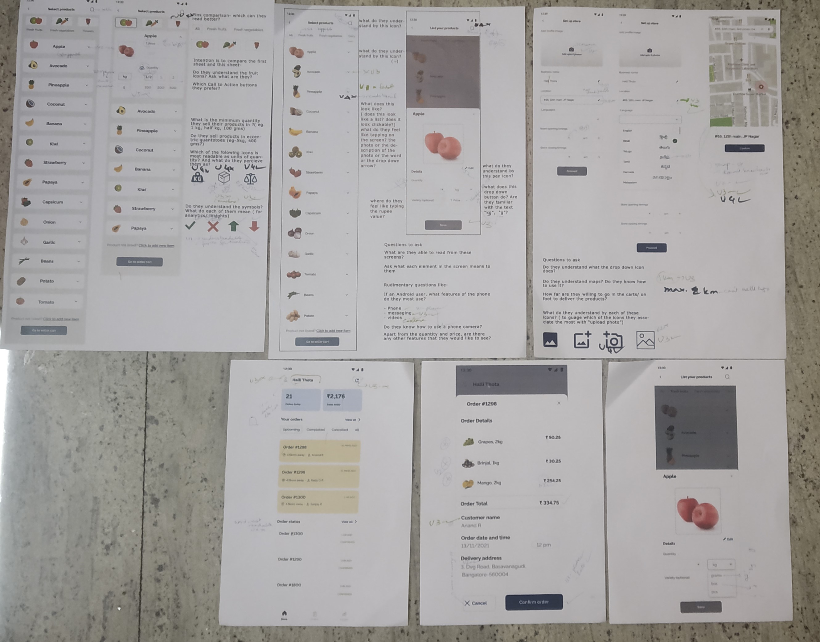
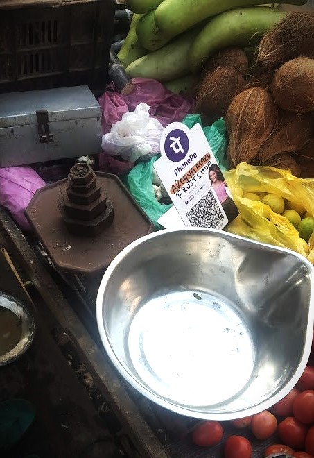
After completing my initial designs, met with street vendors using A3 prototypes to test design assumptions by observing their interaction with icons and buttons and their use of QR codes for UPI, a popular digital payment system in India that lets users instantly transfer money between bank accounts using a mobile phone.
Printouts of prototypes and elements of a vendor environment
First Round of Testing:
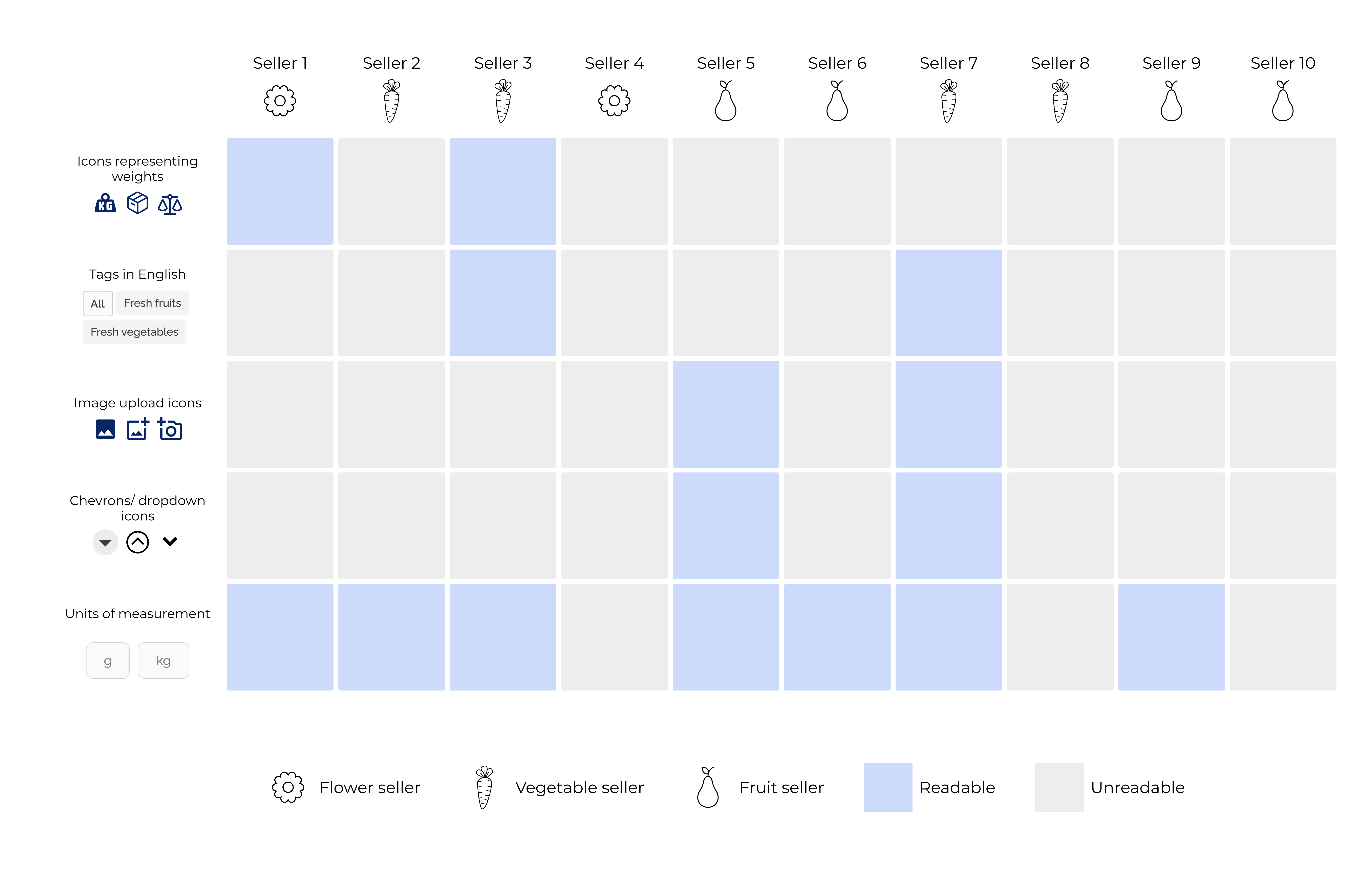
Most sellers had difficulty reading text in English, unless it was to denote weight as grams and kilograms. UI elements like chevrons, carets, radio buttons, etc. were merely perceived as symbols and not as interactive controls.
Second Round of Testing:
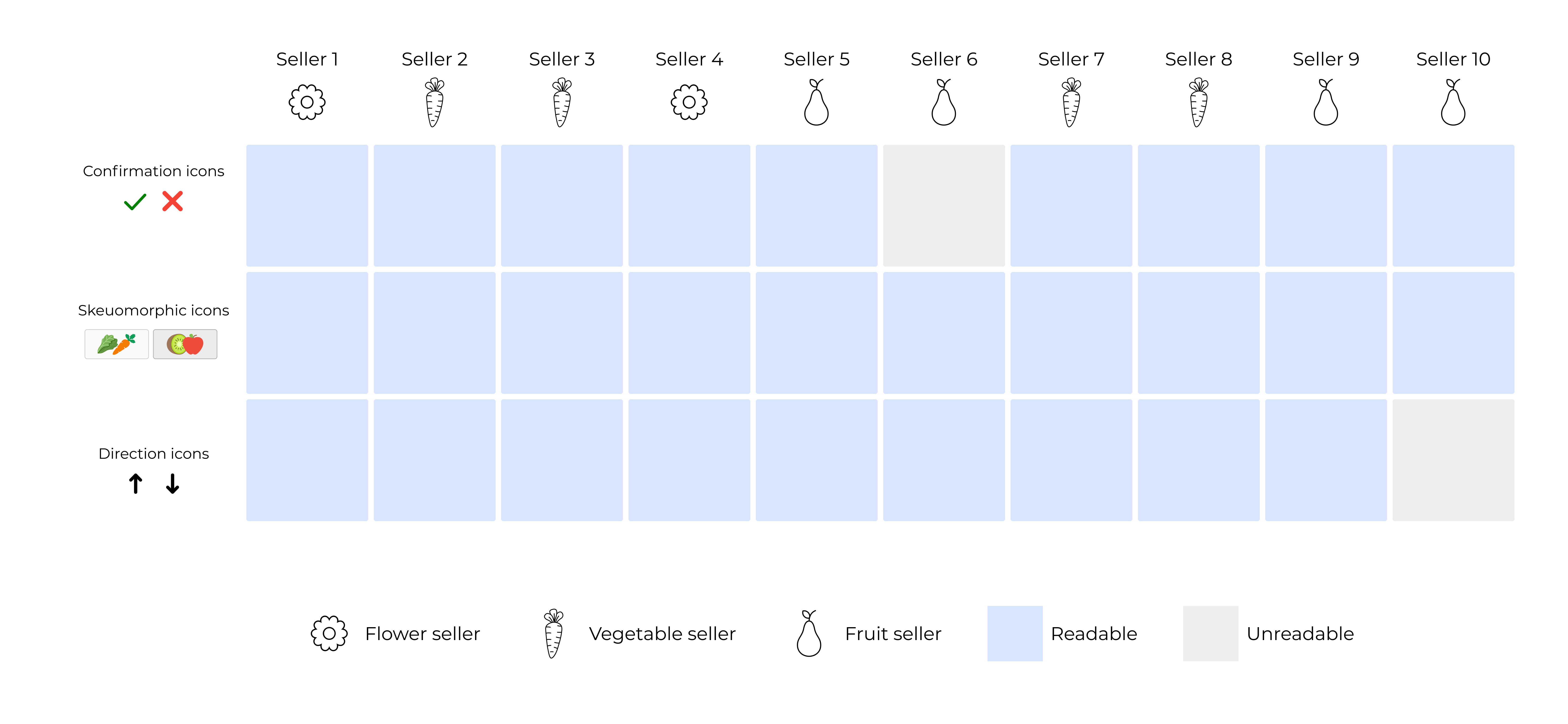
After the second round of testing, 80% of vendors more easily recognized glyph-style icons and read text when it was localized to their regional language.
Style Guide
Designing for Readability and Relatability
Many Vendors struggled with standard icons and plain text, but glyph-style icons resembling real objects, like fruits, crosses, ticks, and arrows, were more recognizable, shaping the app’s visual language.
Accessibility insights guided my decision to create two custom icon sets using glyph-style icons that resemble familiar objects, improving recognition and readability.

What Did Not Work
Streamlining Vendor Onboarding
I had designed an extensive onboarding flow where vendors could upload delivery timings and payment methods. However, while testing we found that the multi-step onboarding process was cumbersome.
Why it did not work: Testing revealed onboarding took 15–20 minutes with assistance, so we streamlined the process to focus on sign-up and inventory upload.
Iterative Design process
Product Upload template
I simplified the product upload section to make it intuitive for vendors, especially when entering product details. For weight units, I drew inspiration from the iron weights vendors use, aligning the interface with their familiar tools for a more user-friendly experience.
Detailed solution
Designing a Seamless Vendor Experience
After a second round of prototype testing, I created a user flow covering the seller journey from onboarding to delivery. Each screen was iterated to simplify the experience, focusing on key features like inventory management and stock adjustments to prevent miscommunication with customers.
Feature 1: Continuous product inventory management and stock management
Enabling vendors to adjust prices easily with a simple toggle empowers them to manage their pricing independently, reducing the need for time-consuming negotiations and helping them maintain healthier profit margins.

The design features a simple inventory list in settings, letting sellers adjust prices and mark items out of stock with a toggle.

Stock updates automatically with sales, and vendors can quickly adjust inventory using touch controls with minimal typing.
Feature 2: Tracking pending orders and Profits
Sellers can view their orders from their homepage where all the new orders come up at the top.
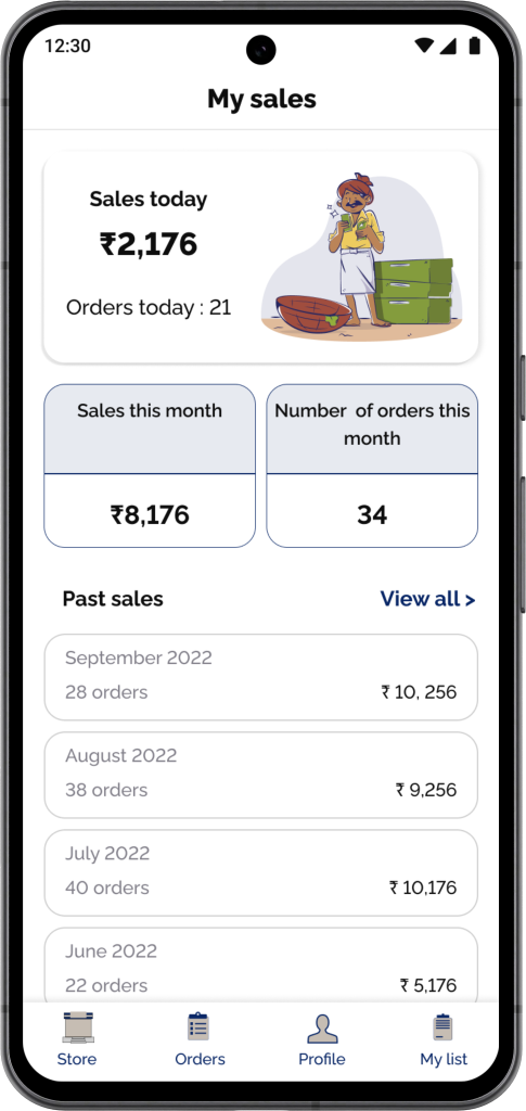
In the settings, sellers can track their sales by day and by month.
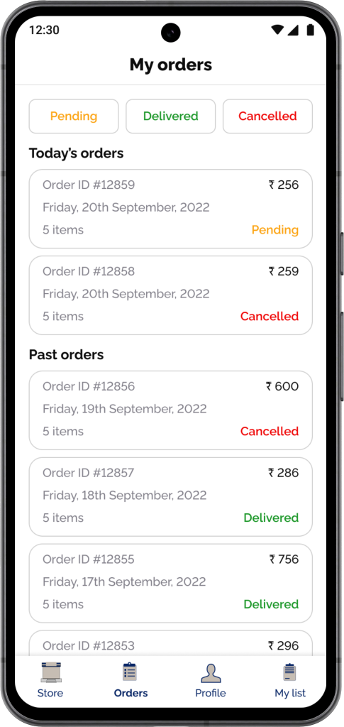
Past orders are categorized by pending, delivered and canceled orders.
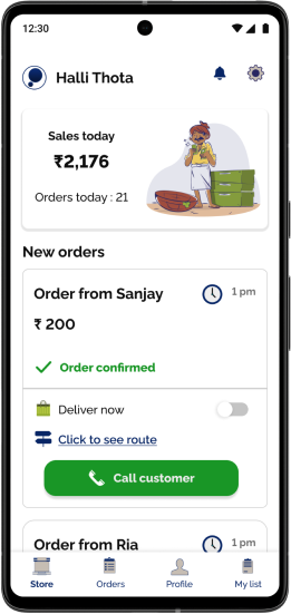
Feature 3: Vendors receiving and accepting orders
Customer placing an order
Customer places an order through the Padose Buyer app.
vendor viewing Orders
Once confirmed, the order appears on the homepage. Vendors can then view the delivery location on a map.
Impact
After designing the end-to-end screens for Padose’s MVP, which launched in April 2025, the platform welcomed over 2,500 sellers from across Bangalore in India within the first few months.
My takeaway
Working on this project taught me the importance of designing accessible products and localizing for non-English speakers. I prioritized function over form, ensuring that the visual design was shaped by user testing and aligned with what vendors found familiar. Given that India has over 10 million local vendors, I focused on enhancing the app’s accessibility and learnability to better support their often-overlooked needs.


%20(1)-min%20(1).gif)